CSS: Do not put height 100% on html, body in 2020
It is not doing what you think it is, lets see why.
The styling
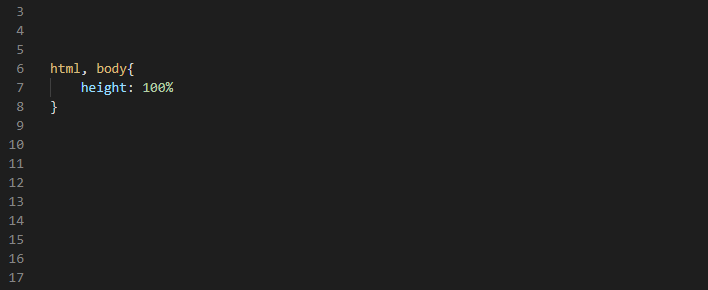
When some content or div need to be 100% height of the window some people may tell you to add height 100% to the body or html tag or both in most cases like so:
html,
body {
 height: 100%;
 position: relative;
}
What happens?
The browser forces the body to be the height of the window, not the height of the content.
This is bad because the body content might be higher than the window height. And the body height is used on touch devices to handle smooth scrolling.
So if the window is a height of 496px but the content flows on beyond that, the browser will think there is only 496px worth of body content. It looks fine and it works fine on your desktop but on some devices this may cause scrolling issues.
Lets see this in action:
This is with no height on the body, notice how the height of the body is shown as:
6958px

Then we add height 100% and look at what height the browser thinks the body is: 496px. Which is the height of the window. Not the height of the content.

What we can do instead
Instead you can use min-height on the body.
Min height 100% will not work which is why CSS added the viewport units: So you use 100vh.
body {
  min-height: 100vh;
}
This now allows your content to be min-height of 100% and bigger.
Browser compatibility is great.
One thing to note: on mobile the viewport height changes when the url bar goes in and out on scroll, so look out for some weird height behavior there if you use vh for heights of elements, they might grow and shrink on scroll.
Sticky footer using the same technique and showing how to get child nodes to fill window height: here
🎉 And we are done! 🎉
Leave a 👏 Clap it if you like it.
Comment 🗨️ to contribute.